Stem and Leaf Plots are easy ways to display data by splitting each observation into two parts; the stem and the leaf. The stems are the digits on the left side and the leafs are the digits on the right side. Stem and leaf plots are useful when finding the mean or organizing the data in order of place value. The plot above shows students scores on a science test along the grading scale. The lowest score was 56 and the highest score was 97.
Friday, April 12, 2013
Box Plot
A Box Plot is a graph that displays five important numbers. The maximum value, the minimum value, upper quartile, lower quartile, and the median number are all displayed. These graphs are useful in displaying outliers and seeing how the data is distributed. In the box plot above, a very wide range of data points are displayed for peoples' IQ's. The data is fairly evenly distributed with almost 50% in the middle or the upper and lower quartile at about 100. The minimum is around 67 and the maximum is over 125.
Histogram
Histograms are frequency distribution graphs that show data points that fall into certain regions. Frequency is plotted on the y-axis while the groups are plotted on the x-axis, so each bar represent the number of times something occurred. In the histogram above, the exam scores of students are shown in intervals of 10. The highest frequency score was between 40-50%.
Parallel Coordinate Graph
Parallel Coordinate Graphs are graphs that can be used when comparing two or more variables or data sets within a graph. These graphs can measure many things at once. In the parallel coordinate graph above, cells of nine different genes are shown. Each gene is represented by one of the nine parallel axis's. The level of expression is defined by a point on each axis.
Triangular Plot
Triangular Plots are used to show the sum of the parts of three variables. The data is shown in an equilateral triangle in order to show the ratios of the three variables. In the graph above, soil composition can be determined by using the three variables. If the know the percent of sand, clay, and silt you can determine what substance you have. Also, you can use the percentages to determine what you need if you were to make something. All the percentages will add up to 100%.
Windrose
Windrose diagrams are used to show wind speed and wind direction over an extended period of time. The circle is usually divided into 16 slices, each representing a different direction. How far each arm extends out is dependent on the frequency that windspeed occurred. One the windrose above, the different colors represent different intervals of windspeed. In this windrose, actual windspeed data is compared to computer generated data.
Climograph
A Climograph is a representation of precipitation and temperature for a specific location over a length of time. Climographs are a quick and easy way to make a generalization about an areas climate. The climograph above is from Boulder, Colorado. Precipitation is represented by a bar graph and temperature is represented by a line graph. According to the graph, May was the wettest month and July was the hottest.
Population Profile
Population Profiles are graphs that show data collected from a specific population based on certain variables such as age, race, income, and sex. Typically the chart will have two categories on the x-axis and one on the y-axis. These charts are often used to show population growth in Human Geography. This chart shows the population by sex and age in the District of Columbia in 2010. It can be determined that the largest group are females from the age of 20-30.
Scatterplot
A Scatter Plot is a summary of bivariate data that is made up of individual points plotted on a graph. The points plotted show the relationship between two variables. Scatterplots can be used to form a trend line and show the association between the two variables. In the scatter plot above, the husbands' and wives' ages are plotted together. Since the points are relatively close together, there is a strong association between the two variables.
Thursday, April 11, 2013
Index Value Plot
Index Value Plots are plots that are useful in looking at changes over a period of years. These maps show variations in a particular situation. In this plot, the USGS is looking at streamflow in New Mexico. There is a standard line and the etchings in the line show variations from the normal as to whether it was a wet of dry year.
Wednesday, April 10, 2013
Lorenz Curve
The Lorenz Curve, typically found in economics, is a graph that represents income distribution. The cumulative percentage of income is presented on the y-axis and the cumulative percent of households is presented on the x-axis. The black line is the line of perfect equality and the area of inequality is the pink shaded region. The Lorenz curve displays the imbalance of income.
Bilateral Graph
Bilateral Graphs are graphs that show more two or more sets of data on the same graph. The graph can be a bar graph, line graph, or another form of a graph. These graphs show both positive and negative values. The graph above shows the trade of clean energy products between the United States and China from 2006-2010. The blue bars represent indicate exports, the green lines indicate imports, and the red lines indicate trade deficits.
Nominal Area Choropleth Map
Nominal Area Choropleth Maps are maps that display areal data. These maps use different colors and patterns to distinguish certain regions. The information presented by these maps is nominal and qualitative data. The map above is a map of Australia showing the different climate regions. This map only shows nominal data of what regions experience what type of climate.
Unstandardized Choropleth Maps
Unstandardized Choropleth Maps are maps that take raw data and put them straight into the map. These maps can often times be misleading because they don't take into account outliers. The map above looks at arrests of Juveniles in the United States. The results could be skewed because of population differences from state to state.
Standardized Choropleth Maps
Standardized Choropleth Maps are maps that display areally averaged data. Instead of just representing a total value, the information is standardized to a particular unit, usually area. They use constant methods for dividing the classes and they are normally very simple. The map above looks at the population in Canada that is under 14. Since the map is standardized, it is known that the data is accurate and set up into equal classes.
Univariate Choropleth Maps
Univariate Choropleth Maps are maps that only analyze one variable. These maps are useful when looking at one topic because they present the data in simple means. The map above measures the estimated median household income in 2008. The map uses simple classification methods, but uses less detail. As the level of income goes up, the color of red becomes deeper.
Bivariate Choropleth Maps
Bivariate Choropleth Maps are choropleth maps that analyze two variables. The information is measured on a scale that allows the variables to be compared. The map above compares the people per square mile in 1990 with the percent change in population from 1990 to 2000 in the South Eastern United States. The different colors represent both of the variables. Looking at the two data sets together allows for conclusions to be made and generalizations to be drawn.
Unclassed Choropleth Maps
Unclassed Choropleth Maps are maps that don't break the data up into classes, but rather just classify the data on a scale. These maps are useful when just a general overview of the data is needed. The map above is from the 2004 presidential election. This is a unclassed choropleth map because the key is a gradient and specific numbers don't have certain colors. The red shaded areas are areas that voted republican while the blue shaded areas are areas that voted democratic.
Classed Choropleth Maps
Classed Choropleth Maps divides the data into intervals and uses shading or coloring to present the data. There are several ways to separate the data, including equal groups, natural breaks, and quantiles. The map above shows the percent of people who are Hispanic or Latino living in each Florida county. The classes are set up equally to best represent the data. The darker green shades represent the counties with the largest Hispanic population.
Range Graded Proportional Circle Map
Range Graded Proportional Circle Maps are maps that illustrate data by groupings. These maps are nice because not only do they show data in the traditional proportional circles, but we see larger circles and larger data numbers. The images in the circles represent a range of data that each of the individual circles falls into. The map above shows river characteristics. The area of the circle measures channel width and the color of the circle approximates the color of the water.
Tuesday, April 9, 2013
Continuously Variable Proportional Circle Map
Continuously Variable Proportional Circle Maps look at more than one variable. The circles do still change with frequency like with a proportional circle map, but they also look at another variable. The circles are proportional to the value of the data. The map above looks at industry in West Germany. Each circle looks at the different types of industry in each city.
DOQQ
DOQQ’s, otherwise known as Digital Orthographic Quarter-Quads, combine the image characteristics of an aerial photograph with the geometric qualities of a map. A DOQQ is basically an aerial photograph that has been georeferenced and orthorectified. All of the images have a resolution of one meter. The map above is an example of a DOQQ as land/water contrasts can be clearly seen.
DEM
A DEM is a Digital Elevation Model. A DEM is a digital file consisting of terrain elevations for ground positions at regularly spaced horizontal intervals. DEM's are in the raster format, and cartographic data is recorded, stored, and processed in a cell or pixel. DEM's are normally built from remote sensing, but they can also be made from land surveying. They may be used to generate three-dimensional images or colorized to bring out relief. The image above is a DEM of New Mexico. It shows elevation by colors and shading.
DLG
DLG, or Digital Line Graphs, are digital vector data. DLG's are digital presentations of what were first paper maps. Data about the map features are stored as lines, points, and areas. DLG's can contain a wide variety of information such as topography, hydrology, boundaries, roads, and utility lines. The DLG map above is of Lake Tahoe and its surrounding area.
DRG
DRG, or Digital Raster Graphic, are maps that are scanned images of USGS standard series topographic maps. This enables more modification than when the map was originally on paper. These maps are important because they are georeferenced to the surface of the earth. They are then projected to the UTM to allow for consistency. The map above is a DRG from the District of Columbia.
Isopleths
Isopleths are used when classes and numerical descriptions can't be used to describe data. Isopleths are contour lines that connect areas with equal values. In the map above of Jacksonville, the lines connect areas with equal amounts of toxic chemical wastes. These maps are good for describing data visually.
Isopach
Isopachs are lines on a map than connect points of equal ground thickness. Different colors are often used to shade between the lines and to connect areas of the same values. The map above is an Isopach map off of the West coast of California. The lines and colors represent the areas of the same values.
Isohyets
Isohyets are lines connecting points of equal precipitation. These maps are useful in noticing trends of rainfall and predicting future rainfall. The map above is shows Isohyets over the United States. The lines and colors show areas with consistent rainfall and the amount of rain.
Isotachs
Isotachs are lines connecting points of equal wind speed. The map above is an Isotach map of the United States. The lines in the north and south are relatively straight. Like isobars, the closer together the lines, the steeper the change in the winds.
Isobars
Isobars are lines that represent points of equal atmospheric pressure. The atmospheric pressure is reduced to sea level for mapping. This type of map is very useful when forecasting the weather. Lines that are closer to each other represent a large change in pressure. The map above is a surface map of the United States. The isobars can been seen as the constant lines.
LIDAR
LIDAR stands for Light Detection and Ranging. LIDAR is a remote sensing technology that uses pulses from a laser to find a range or other information about a target. The photo above is from New York City.
Doppler Radar
Doppler Radar is a form of remote sensing that uses microwaves to get details about the weather. Doppler can be used to calculate the velocity of rainfall, frequency, and also rotation within a storm. Doppler is key in determining the strength of storms and detecting potential damaging winds or tornadoes. The radar above is from the 2011 storm that hit the Indiana State Fair. The red represents the heaviest areas of wind and rain. Meteorologists can look for signatures in the radar to detect tornadoes or gust fronts.
Black & White Aerial Photo
Black & White Aerial Photos are used to show cities, neighborhoods, and roads. They are used when surveying a certain area of land. These photographs are shot from above in order to show more area. The roads stick out more than the vegetation in black and white photos. The photo above is a good black and white picture, as the roads can been seen and vegetation isn't the focus.
Monday, April 8, 2013
Infrared Aerial Photo
Infrared Aerial Photos are photographs used to show changes in the environment over time. Infrared film captures images with wavelengths that lay outside of visible light on the electromagnetic spectrum. The infrared aerial photograph above shows the San Francisco River Delta.
Cartographic Animations
Cartographic Animations are maps that allow for spatial visualizations. They are used to show change in something over time. The map above, when in motion, shows a hurricane move across the state of Florida. Weather forecasters use cartographic animations to warn where the most violent weather will occur.
Statistical Maps
Statistical Maps are maps that show a quantity of a statistic of a geographic area. The map above shows the average commute time by state in 2003. The states in red had the longest commute times, while the states in green had the shortest.
Cartograms
Cartograms are maps that have distorted geometry in order to show the information of the variables. They maintain political boundaries while indicating the weight of a variable. The cartogram above shows world meat consumption. It can be seen that Africa has shrunk dramatically, while Japan and Britain have grown.
Flow Maps
Flow Maps are maps that show the movement of goods or people from one location to another. The map above shows immigration to the United States by region of birth in 2007. The larger the arrow, the more people that came as evidenced by the arrow from Asia being the largest.
Isoline Maps
Isoline Maps are maps that use continuous lines to join points of equal value. These maps are also identified as contour maps, where the contour interval is the distance between contour lines. The map above shows the precipitation in Washington in 1996. The lines represent points of equal rainfall and the different colors show this.
Sunday, April 7, 2013
Proportional Circle Map
A Proportional Circle Map is a map that uses varying sizes of circles in order to present data. The larger the circle is, the higher proportion of the data. The map above shows the urban population in Michigan, and parts of Illinois, Indiana, Ohio, and Wisconsin. The key shows that the larger circles represent larger urban areas. This can be seen in Detroit and Chicago.
Choropleth Maps
A Choropleth Map is a type of thematic map that uses shades and patterns to present data. These maps are good ways to show how a measurement varies across a geographic area. The map above shows the forecast change in jobs over the United States from 2009 to 2010. There are 6 different categories, each represented by a different color and each representing different numerical values.
Dot Distribution Maps
A dot distribution map, or dot density map, uses a dot to symbolize a point of an occurring feature or phenomenon. Spatial patterns are represented by relying on visual scatter to determine the density of dots. Dot maps use dots in an area to show size and frequency. The map above shows the township population in Ohio, where one dot is equal to 100 people.
Friday, March 15, 2013
Propaganda Maps
Propaganda Maps are aimed to persuade their viewers a certain way. Just like all other forms of propaganda, maps are used to make a point or convince an individual or group of people. These maps display images that aren't true, but they are instead falsified to sway an opinion. The map above is a map of how American's view Asia. It promotes stereotypes and ideas that aren't true.
Hypsometric Maps
Hypsometric Maps are maps that represent changes in the elevation of the land through the use of colors or shading. The map above is a state map of Maryland that uses different hues of red to represent changes in elevation. The darker shades in the Western parts of the state represent higher elevations, and the lighter shades near the coast represent lower elevations.
Thursday, March 14, 2013
PLSS Map
The PLSS System, otherwise known as the Public Land Survey System, is a system that utilizes baselines and meridians in order to define regions. The PLSS separates most of the United States into townships and sections through meridans and lines. The map above shows these areas and divisions in the United States.
Wednesday, March 13, 2013
Cadastral Map
A Cadastral Map shows detailed information about real property in an area. In the map above, all boundaries of lots are clearly seen. These maps are usually very public and often produced by the government.
Thematic Map
A Thematic Map is a map that focuses on a specific theme or topic. They show spatial distribution for specific data themes. They typically don't show natural features, unless they are being used as reference points to enhance the maps theme or focus. The map above is a map showing Canada's population change in certain locations from 1996 to 2001. The map has a certain theme that it is trying to portray and uses territorial and provincial borders to give it more of a reference.
Topographic Map
http://geography.about.com/od/understandmaps/a/map-types.htm
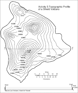
A Topographic Map is a type of contour map that uses contour lines to portray relief, shape, and elevation of the land. They capture three dimensional aspects of terrain on a two dimensional surface. Hills, cliffs, ridges, and valleys are just a few features denoted by topographic maps. When the contour lines are closer together, the change in the third dimension is largest. This map represents the Big Island of Hawaii. The coastal areas are flatter, represented by the contour lines being farther apart, and the steeper areas can be seen by the closely spaced contour lines.
Monday, February 25, 2013
Planimetric Map
http://college.cengage.com/geology/resources/protected/physicallab/resourcedesk/glossary/p/planimetricmap.htm
A Planimetric map is a two dimensional map that is used to show roads, cultural, natural features, and information that is not related to surface topography. Planimetric maps don't regard elevation, they only deal with horizontal positions and features. The map above shows the pH of precipitation from March 25 to April 21, 1991. This map doesn't deal with surface topography but instead a natural feature: acidity in rainfall.
Mental Map
Mental maps are representations of how people view the world around them. Geographers are interested in learning how different people view the things surrounding them. The map above is a mental map of Michigan from the perspective of someone from Michigan. It represents the prominence of Michigan in this individuals eyes. Michigan and the states surrounding it are the largest, while those states further away are small and less important.
Subscribe to:
Posts (Atom)